Study Task 3 - Part 2
After our studio session today we were asked to look at the lists we had made related to our personal research and to then:
- Identify a range of examples of Graphic Design appearing in different design contexts
- Identify a range of Graphic Design performing different functions
- Identify a range of examples of Graphic Design communicating different types of messages/ideas/concepts
- Identify a range of examples of Graphic Design using a different tone of voice
- Identify a range of examples of Graphic Design produced at different scales/places
For each one of these categories I am going to use the lists I made with my blog group as a guideline to ensure I cover everything.
CONTEXT
ADVERTISING
I have always loved this advert in the Vogue magazine. I think it is striking and I love the composition of the photograph. It has been really well thought out in terms of use of colour, space and structure.
VISUAL IMPACT
This image immediately captured my attention as it is visually intriguing and inventive.
PACKAGING
This packaging has been well designed and constructed. The design itself illustrates and portrays the word 'Samurai' as the bottle looks like it has been sliced in half.
This packaging cleverly reflects the product. It is simplistic and not only do I like the design of the jar but I think the label works really well.
VISUAL IMPACT
This is a clever use of the Nike logo as it has been situated in a stunning environment to create visual impact and making it very memorable.
FUNCTIONS
PROMOTION
I think this is a really clever idea as it will be seen everywhere and is a way of promoting through interaction.
Straw advert
PROMOTION
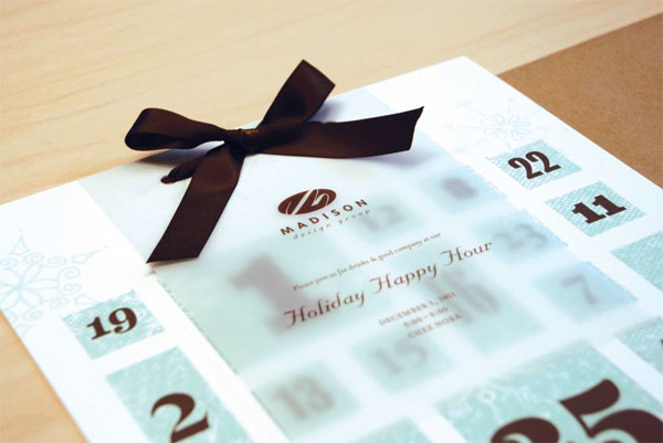
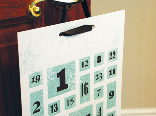
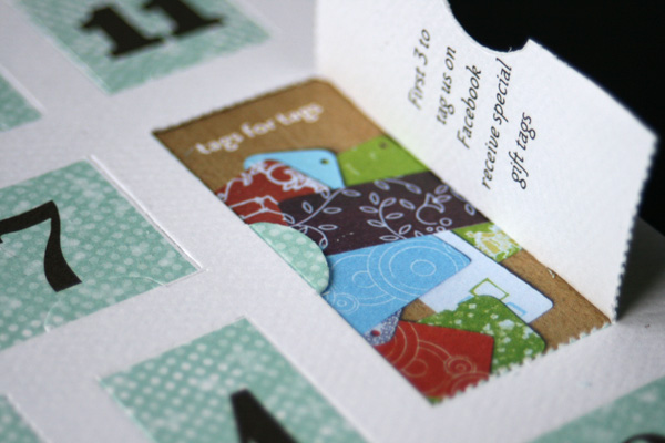
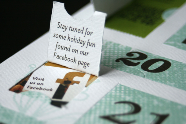
This is another example of promotion through interaction as the advent calendar has been designed especially to promote a business rather than having the stereotypical chocolates inside.
 Promotion
PROMOTION
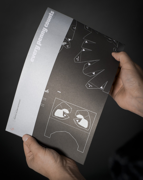
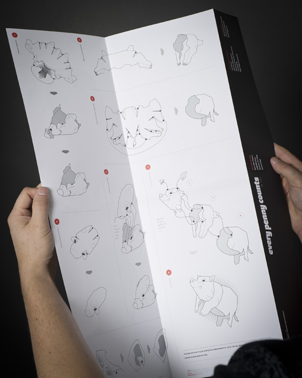
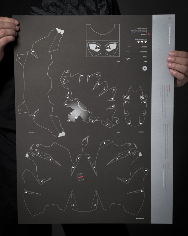
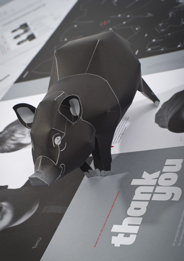
'The University of Houston Graphics Alumni Partnership (UHGAP) is an organization made up of alumni whose primary focus is to give back to the Graphic Communications program in various ways. One of those is by providing scholarships to the best and brightest students. To help raise funds for the scholarships a series of posters were created to help raise awareness of the campaign.'
This was taken from the website I found this on, and it explains the purpose behind the design. Interestingly enough people had commented on a forum and said that because of how complicated the design of the pig was, it meant that not everyone could participate, perhaps implying a flaw in this advertisement and promotion.
 Promotion and participation
TO GRAB ATTENTION
This instantly caught my attention when I was browsing the internet. I think it is a very unique advert with a memorable concept.
AUDIENCE PARTICIPATION
When I came across this I found it really funny and most certainly different so anything I've seen before. I think it would catch on quite easily in places and would be spoken about a lot, which indicates it is a successful advertisement.
ADVERTISE
I thought this was a clever use of image manipulation. It works well as an advert as it captures attention instantly.
This image caught my attention as it is quite out of the ordinary. The plates have been used to advertise Hermes and they all have the Hermes print on them. The colours of the beach have been reflected in the plates also, allowing there to be a consistent colour theme.
CREATING AWARENESS
Without even having to look at the text at the bottom of this advert it is obvious that the toilet roll is representing an advert to promote recycling. I think this shows that the image has been successfully used and it is very memorable.
MESSAGES
FACTUAL
This image represents Nike whilst at the same time provides facts about the company. This is a clever use of advertisement and I think it works really well to promote and portray a company.
SAFETY
This is such an effective way of making people aware of what may happen if you are driving whilst sleepy. The simple illustrations combined with the image of the eye closing is enough to make you think.
This advert promotes Mercedes-Benz and also one feature in particular called the night view assist. By simple manipulating the image to form the word child with all of the lights outside they have captured their message in a powerful way.
I thought this was a really clever way of making people think about health and safety as so many people will walk up and down those steps every day so it would definitely create awareness.
This is one of my favourites. I particularly like the way they have formed an image of Australia on fire within the end of the cigarette. This creates awareness for people to understand how something so small can cause such a huge impact on an area and people's lives. This could have a secondary effect too and cause people to stop smoking.
TO COMMUNICATE
I think this visually communicates an important message. It communicates with the audience through text and imagery.
SPEAKS FOR ITSELF
This is a really quirky way to portray FedEx as being such an effective company which transports goods all around the world. The image speaks for itself and needs no explanation and little use of text which is why I really like it.
TONE OF VOICE
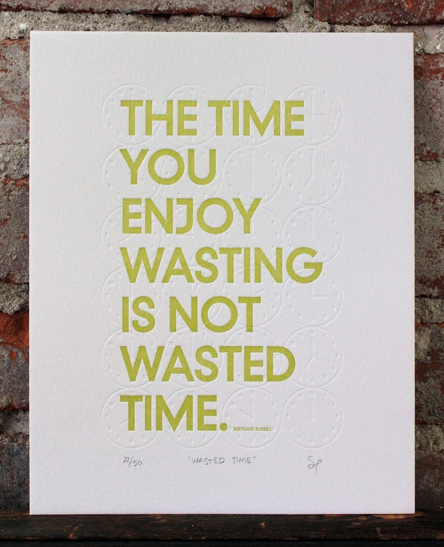
THOUGHT PROVOKING
I think this phrase is so true and most definitely thought provoking. I really like the simplicity of the design and the colours used.
Thought provoking type
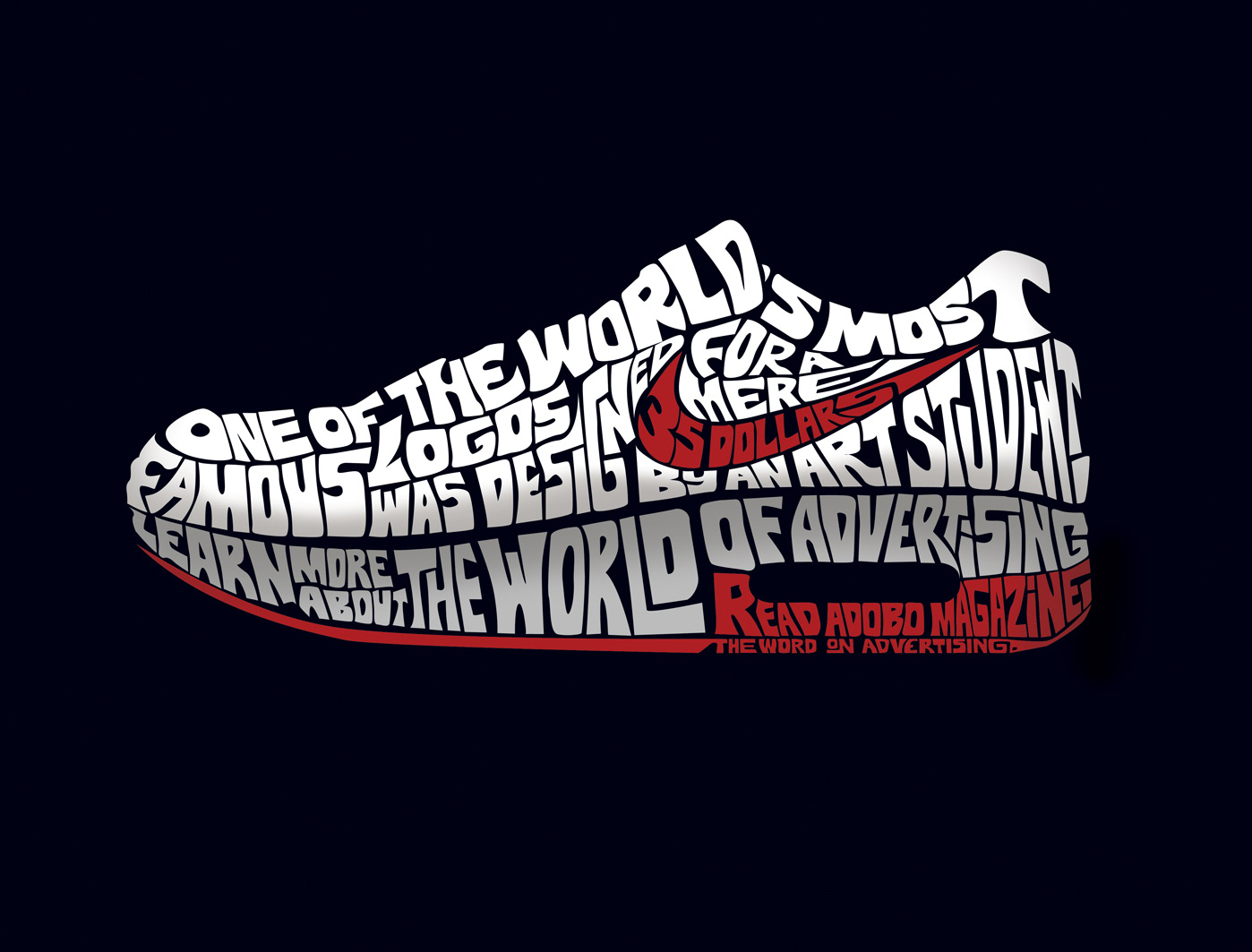
I think this is a really clever use of typography as it is portraying the word's meaning through the design.
SERIOUS
This has a very serious tone to it, encouraging people to seek help if they are being abused. The look on the woman's face speaks volumes.
INFORMATIVE WITH HUMOUR
I found this funny as soon as I saw it. I think a lot of people would be able to relate to this advert which is why it makes it memorable.
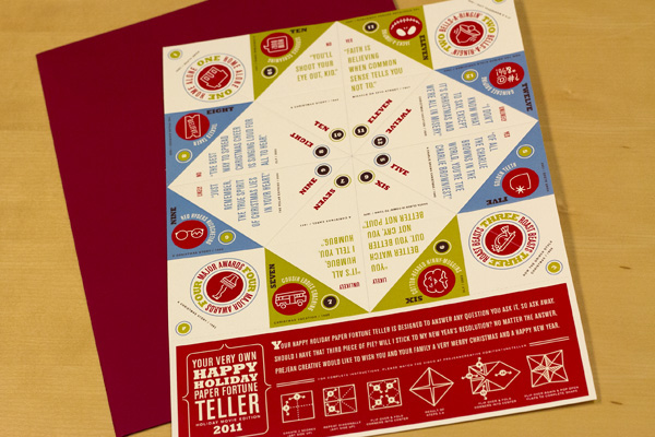
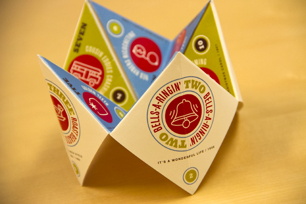
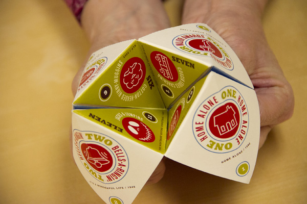
PLAYFUL
This is designed to be a playful, fun and interactive fortune teller which brings to life the fun of a holiday. The colours used are playful, inviting and the structure is easy to follow and assemble.
SCALES/PLACES
LEAFLET
This leaflet is pretty self explanatory and works well to capture attention as the colours used compliment each other and stand out.
BAR
From a distance you would think this said one thing but the small print says otherwise. This is a good way to get customers in and will make them laugh the closer they get to the advert.


