During
this session we got into our blog groups and shared the work we found from last
week's session. We then went around the group and each person spoke about what
they had found. When doing this we all made notes about each person's interests
and the images they had found. I found it interesting because we were able to
find out what everyone is motivated and inspired by and we were also able to
share artists, many of which I really liked.
Here is what I wrote down for each person:
James
- Negative space
- Minimal
- 2 or 3 colours maximum
- Science fiction
- Futuristic
- Illustration
- Humour
- London underground
- Informative
- Play on words - makes you think
- Change of identity within graphic design
- Photography - realistic style - Terry Richardson
- Use of red and blue
- Kate Moross
- I love dust - design agency
- Typography and logo design
- Hand rendered
- Retro feel
- Detailed illustration
- Black lines
- National forest - American agency
- Screen print
- Pat Perry illustration
- Fine art screen prints
- Dark mood
- Stranger and Strange - company
- Colourful
- Simplistic
- Street photography
- Stefa Sagmeister
- Bold colours
- Street art
- Olympic logo
- Classy designs
- Kate Moross
- Crack magazine (Bristol)
- Music packaging
- Wax effect
- Negative space
- Pastel colours
- Packaging
- Norma bar
- Infographics
- Simplistic
- Block colour
- John Moore
- Caroline Pratt
- Pixel camera collection
- Ben-Ashton Bell
- Drew Millward
- Michael Shantz
- Banksy
- Julene Harrison
- Kai Isselhorst
- La Dispute
- Nicole Jopek
- Ollie Keable
- Sabrina Ward Harrison
We then had a class discussion about what each group had found and from this we were able to produce a set of qualities which can be found within graphic design work.
- Creative use of type
- Visual quality
- Tone of voice (humour, quirky, whit)
- Detail
- Simplicity/minimal
- Meanings/messages (hidden?)
- Interactive audience engagement
- Style/aesthetic (links to visual quality)
- Media and production
- Form/format
- Personal interest/content
- Visual content
- Word play/language
- Structure and layout
Our task was then to identify 5 criteria from the list and then identify a further 5 images for each category.
I have chosen...
- Creative use of type
- Detail
- Simplicity/minimal
- Structure and layout
- Word play/language
Creative use of type
I really love this packaging design. I think it is extremely unique and intriguing.


http://www.graphic-exchange.com/07packaging.htm
I came across these images on the Graphic Exchange website and I absolutely love the use of type and how all of the typography has been engraved within the skateboard. I think it looks professional and it gives each skateboard a personalised effect.


I feel as though this is a really clever use of type. It is inventive and has been designed to work in conjunction with its design/advertisement purpose.


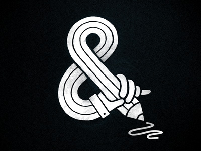
This isn't something which would normally catch my eye, however when I came across it on pintrest I was intrigued and clicked to enlarge the image to find out what it was made out of, and it turns out it is made out of parts of a bike. The black and white '&' is simplistic and quirky.

Detail
This image was created by Christoffer Relander. He focuses on fine art, graphic design and photography and I think he has put a lot of thought into creating these intricate designs.


This illustration is taken from the Graphic Exchange website. I love the use of colour and the detail. It gives the website an inviting feel.
This was also from the Graphic Exchange website on the homepage. I love the sepia tones with the slight introduction of colour.

I came across this artist by clicking on the links section of the Graphic Exchange website. I think the work is really quirky and I love the way she has manipulated the images and included detailed illustrations within each one.

I really love the detail in this pattern and think the water colours work really well. As drawing it not one of my strengths I feel that I could take inspiration from this style of work as it is more doodly!

Simplicity/minimal
I feel that this design is simplistic yet effective with a selective use of colour but not too much of it. It has a good balance.
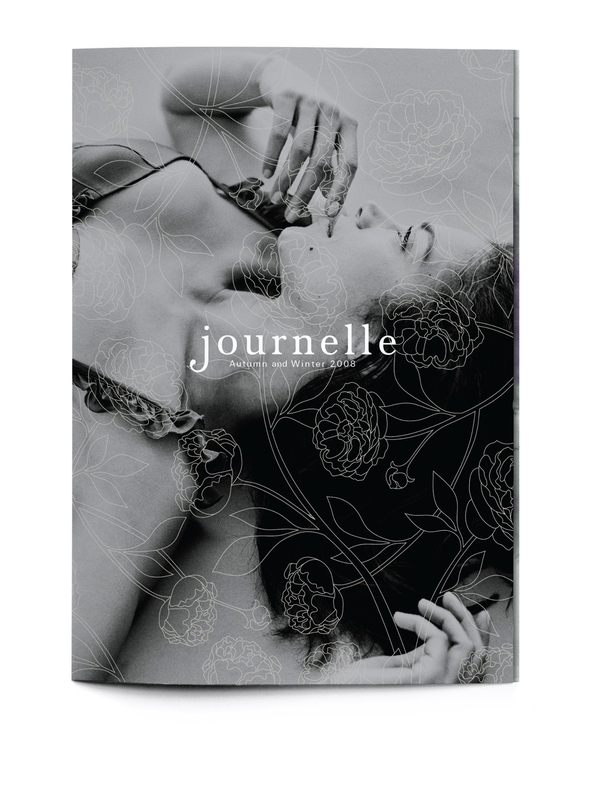
This magazine layout is clear to the reader and has a large element of style and class. This kind of editorial work is very appealing to me as I have done some of it before and I love to see how I could improve.
I love this colour scheme and feel that the logo and brand name itself is really professional looking.


Minimal, monochrome and effective.


This design is taking minimal to the extreme. However I still feel that it is effective as the negative space works in a positive way, drawing the eye to the text and the image without any distractions.

Structure and layout
The structure and layout of this design has been very well thought out. I like how all of the images are simple block images in a simple circular shape with just enough text below to inform the audience.

I find this structure and layout both interesting and emotive. The poster was designed by Peter Crnokrak to represent every person who has lived and died on earth from 3200 B.C.E to 2009 C.E. While the hole in the middle represents everyone who died in a war, genocide or massacre.


In terms of layout I think this works really well. The way the silhouette of a woman has been manipulated to create the illusion that all of the numbers are breaking away from her is really clever.

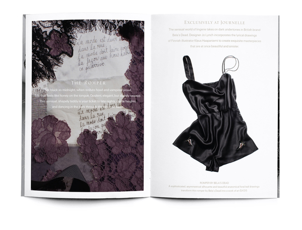
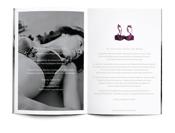
I think the structure and layout of this packaging is visually stunning, similarly the magazine layouts are extremely effective.
Word play/language
I absolutely love this. By simply editing the positioning of the letter 'O' the designer has mirrored the meaning of the word through their design.

I came across this and thought I would add it to my blog as I found it quite humorous.

This caught my eye as it is quirky and clever in the way that the message is portrayed.

I think that although the quality of this image isn't the best, the message it portrays is very true.

This demonstrates clever use of typography and also creates two images, a musical note and an image portraying a message.

As I am a fairly philosophical person this captured my attention instantly. I think all of the typefaces compliment each other and work really well to create this image.

8/10/12
Today we got into our blog groups to review the work we had completed. We all put our work out infront of us and then chose one from each category to work with.

We then had to write about each chosen image:
- Function - Why does it exist? Inform?
- Design context - Branding, fictional?
- Tone of voice - Playful, serious?
- Message/idea/concept - What is it trying to communicate?
- Intended scale - What size is it/place of delivery?
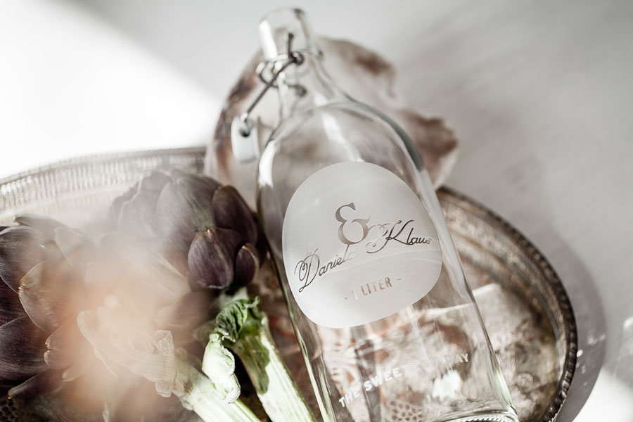
CREATIVE USE OF TYPE
1. Function - To advertise the wine
2. Design context - Branding
3. Tone of voice - Informative
4. Message - Portraying the organic wine
5. Intended scale - Wine bottle
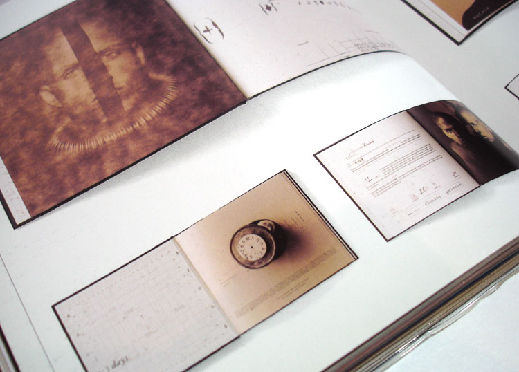
DETAIL
1. Function - Illustrative
2. Design context - Fictional/branding
3. Tone of voice - Playful
4. Message - Hand rendered mixed with image
5. Intended scale - Web
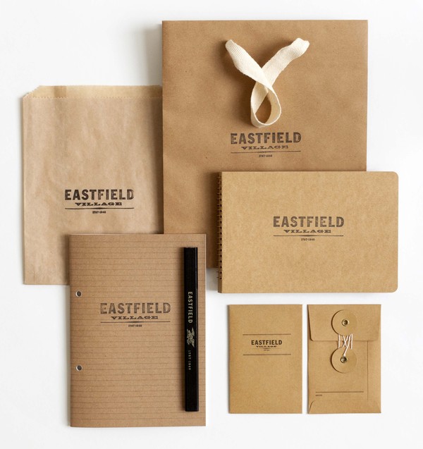
SIMPLICITY/MINIMAL
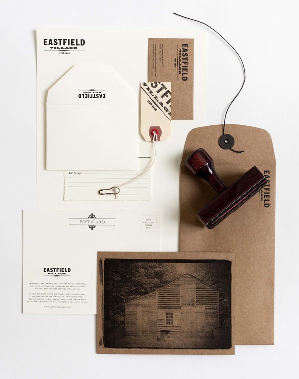
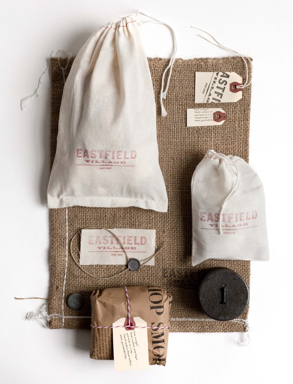
1. Function - Advertise Eastfield Village
2. Design context - Advertising
3. Tone of voice - Professional and informative
4. Message - Portraying the company
5. Intended scale - Same as image
STRUCTURE/LAYOUT
1. Function - It exists to inform people about how many people have survived since a certain date and represents how many have died.
2. Design context - Non-fictional
3. Tone of voice - Serious, emotive, factual
4. Message - Facts about war
5. Intended scale - Leaflet size
WORD PLAY/LANGUAGE
1. Function - To make people think
2. Design context - Informal design
3. Tone of voice - Quirky/comical
4. Message - Communication of the image '&'
5. Intended scale - Web
We then had a studio discussion about how hard we found this task. Most people agreed that it was hard as a lot of the work we had collected wasn't necessarily graphic design. This isn't a problem however as we discussed that graphic design doesn't necessarily need to tick all five boxes, along as it serves it's purpose.
Finally we were asked to look at everyone's work on our table and create an exhaustive list of our responses to this task. We did this by reading out our written responses and then looking at the work on the table to see whether there was anything which could be added.
Our lists are as follows:
FUNCTION
- Inform
- Advertise
- Statement
- Creating awareness
- Make people think
- Make people laugh
- For decoration
- Aesthetic
- Promotion
- Reflection
- Representation
- To grab attention
- To capture moments or feelings
CONTEXT
- Fiction
- Non-fiction
- Advertising
- Informal design
- Editorial
- Infographics
- Typographic poster
- Packaging
- Sculpture/Installation
- Print
- Media
- Illustration
- Audience participation
- Visual impact
- Representation
- Shapes
- Composition
TONE OF VOICE
- Playful
- Informative with humour
- Serious
- Lighthearted
- Mature
- Comical
- Contemporary
- Informal
- Formal
- Thought provoking
- Serious
- Scientific
- Atmospheric
- Intelligent
MESSAGE
- To inform
- Graphic design humour
- Intelligent use of type
- Speaks for itself
- To promote
- To communicate
- Factual
- Temporary adoration
- Identification
- Energy
- Safety
- Web
- Advert in magazine
- Exhibition
- Leaflet
- Poster
- Carrier bag/food shops
- Cafe/restaurant
- Gallery
- Decoration in a house
- Framed
- Mounted
- CD/vinyl cover
- Logo
- Billboard
- Screenprint
- Slideshow
No comments:
Post a Comment