Powerpoint notes
Editorial and Publishing
General magazine categories:
- Fashion
- Music
- Lifestyle
- Health and beauty
- Current affairs
- Photography
- Technology
- The arts
- Hobbyist
- Food and cooking
- The home
Publishing:
- Fiction
- Non-fiction
- Travel
- Biographies
- Manuals
- Children's books
- Education
- Training
- Referencing
- Languages
General publication:
- Annual reports
- Catalogues (commercial)
- Catalogues (event)
- Brochures
- Instructional
- Public sector
- Self-publication
- Creative press
- Fanzines
Retail and promotion:
- Tags
- Bags
- Logo: advertising
- Signage
- 3D environment
Product and packaging:
- 3D
- Product drives design
- Calendars
- T-shirts
- Paper products (Christmas labels)
- Gift wrap
- Bookmarks
- Stationary (Paperchase, M&S etc)
- Wallpaper
- Exterior of the container
- Methods of distribution
- Range: colours, type, format
- Belly band
- Opulent packaging: reason people buy things
- Stock
- Decorative/simplistic
- Fun
- Formal
- Protection
1. Information and way-finding
2. Publishing and editorial design
3. Branding and identity
4. Product and packaging
5. Retail and promotion
Task
SITES/BLOGS
5 examples of websites/blogs that will help you define information and way-finding design:
DEFINITION
Information and way-finding graphics is a way for the designer to communicate facts, statistics and data in a visually intriguing way, both large scale and small scale.
EXAMPLES
designspiration.net
Sifang Art Museum Logo, Identity, and Wayfinding.
Below
is a minimalistic design to direct people to where the toilets are
located. The symbols used are universal and everyone knows what they
mean. This means that the content and function are successful. It
reaches a wide audience and is clear and to the point. I think that
overall this design is professional and easy to follow.
Cartlidge Devene way-finding
With
regards to the content, it is striking, eye-catching and most
definitely informative. It is aimed at anyone and everyone who visits
this place it fulfils the function to point people in the right
direction. The minimal use of text is also very successful and it
just shows that sometimes symbols and imagery can be just as
effective as text, if not more.
latitudegroup.com.au
Large scale environmental graphics by Latitude in the QV Melbourne carpark.
This is an example of a low budget piece of way-finding art. It is bright, colourful and informative. It could be argued that it may be a bit of a distraction for drivers in the carpark but on the other hand it has been designed not to be ignored and to inform the drivers of which way to go. The choice of media is the reason why I said it is low budget, as I would have thought that the transfer of the text to the walls would be quite a simple and low cost action to take.

wayfindinguk.wordpress.com
The following images are linked to the London 2012 Olympics.
The content design is continual and flows really well, whilst the genre is fun and encourages people to want to get involved and watch the olympics. Their function is to be informative whilst standing out as being a bit different than your average advertisement. Having not been a big fan of the logo it is hard for me to comment on the success of the design, however I do think that the placement of these designs was well thought out and they are most certainly eye-catching.
Here are images of Selfridges in London of work by Cartlidge Levene.
These way-finding designs for Selfridges are definitely my preferred style of graphic art. It is crisp, attractive and fulfils its purpose without being over the top. Visually it is very easy to follow, whilst the content is clear and informative. The chosen use of media is successful as it is made out of a sturdy, well crafted material which complements the chosen design.
Sainsbury's.
The red background with the white symbols in the foreground works really well to capture people's attention as they walk past. The symbols are aimed at all ages, so a wide audience as the content is simplistic and easy to comprehend.
creativeroots.org
Below are examples of infographics for Taiwan.
Having instantly been attracted to this design I think that it shows how successful it is. The chosen colours and the simplicity of the chosen media both work really well to produce a set of graphic designs which fulfil their purpose. They are low budget designs which have been hand crafted and photographed to form informative infographics. The content of each design is educational and the overall effect that each design has is very effective.

thecoolhunter.net
simmINN Flight Simulation Center in Stuttgart, Germany.
Although it is not an obvious example of way-finding, all of the lines are there on the floor indication the direction in which the aeroplane should be 'flown'.
Tokyo's College of Music.
Aesthetically this design is very effective and visually pleasing. Colours are the key point of this design and the minimal use of text and numbers are just enough to provide people with the necessary information. The content is therefore well structured, with the format complimenting it at the same time. The modern, simple building works well with the block colours and the strong contrasts with the colour choices.
Modern design car park.
This is such a unique and memorable design. The simple line drawing on the side of the building has added a quirky and outstanding feature to the building.
SITES/BLOGS
5 examples of websites/blogs that will help you define product and packaging design:
DEFINITION
Product and packaging is one of the most important ways in which a business can excel and sell themselves to the general public. If their packaging is successful then this means that their branding has been a success and therefore memorable.
EXAMPLES
creativeroots.org
Olive oil bottle designed to represent the Greek Islands.
The overall design of this bottle is refreshing and different. The use of colours is very professional and it is aimed at a wide audience, informing them about the Greek Islands whilst at the same time selling their product.
Swiss coffee packaging design.
This design reminded me of papercut work I have seen in the past. The colours really complement each other well and enforces a successful design. The content of the design has really been thought about closely and it definitely stands out as being a unique bag of coffee in comparison to many other brands.
lovelypackage.com
Creative jam packaging.
These jars of jam stand out to me as being well suited to a large audience, but maybe particularly aiming at the younger generations. By simply altering the background colour and image slightly on each jar the designer has managed to portray the product successfully. It is a fun design not to be taken seriously and looks like it would fit under the low budget category.

Creative masculine candle packaging.
With a masculine choice of colours, a bold font and a very simplistic design, this candle packaging works really well to sell this product. In particular, the worn out effect that the packaging has works really well giving it a 'vintage' effect and style to it.
plentyofcolour.com
The packaging for the gift voucher was particularly eye-catching in my opinion. I feel that anything with brown and black used for the colour scheme is really effective and in this case looks very sleek and attractive.

Amelia Rope chocolate packaging.
By simply changing the colour of foil within her chocolate collection, Amelia Rope has managed to design a diverse and successful style of packaging. So simple yet so appealing to the customer and very well thought out.
designspiration.net
In terms of packaging I feel that both of these designs are very well thought out. The Capital Kitchen design is refreshing and appealing, whilst the salt and pepper containers using the design of a battery is very clever and instantly makes you want to buy it as it is so different from the average containers.

jkrglobal.com
As a packaging design this is by far one of the most successful. The design of the bottle has been taken into consideration as the designer has incorporated the idea of water dripping down from beneath the lid. The label is simple, simple enough for children to understand, enabling it to reach a wider audience. The hair products also caught my attention as they are sleek, professional looking. Aimed at a certain audience who require hair products such as the ones in the image.
SITES/BLOGS
5 examples of websites/blogs that will help you define branding and identity design:
DEFINITION
Branding and identity helps to define a company and informs the customer about what it is they are wanting to promote or sell.
EXAMPLES
identitydesigned.com
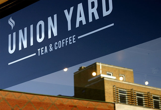
Union Yard is located in Norwich and below are the images of their identity (logo design) which defines them as a brand.
By simply incorporating the symbol to represent steam it makes the logo recognisable as being related to tea and coffee. They present themselves as being professional and give the impression that they sell high quality beverages.
The inspiration at the heart of the Union Yard brand is the ubiquitous card coffee cup. It’s difficult to make it into work in the morning without spotting tens of corrugated containers clutched in besuited hands, usually alongside a Smartphone or copy of the morning newspaper. For the logo, the initial of Union Yard becomes one such steaming receptacle, used to contain any number of hot beverages. Although the Union Yard wordmark features the logo and takes precedent on signage and across many printed applications, the ‘U’ logo functions in isolation, providing the flexibility to extend the brand across diverse products.
mintdesignblog.com
The pastel colours work really well to represent ice-cream and the use of the shapes to make up the cone and ice-cream looks really professional and well thought out. By simply adding a small amount of text to one of the ice-cream balls in each design we are informed about the flavours. The content is therefore minimal but enough to create impact. Aimed at all ages and is also child friendly when considering the materials used.
This is a lovely design, the colours work really well and the content is well proportioned and well composed. It reaches a wide audience and looks like it would be a memorable design.

thomas-printers.com
When considering how a design can have an impact on representing a designer I think that the two examples below are highly successful. The business cards are inviting, professional and all of the necessary content is there to inform the recipient.
bigfish.co.uk
Here Waitrose have used a personalised label design within their packaging to help create their identity. The design of it is professional and the colours used tie in with the colours used within the Waitrose logo.
Harrods have created this illustrative design to represent an area within their store. It is bold, striking and works well to create a design which is intricate enough to stay in the customers mind and make them want to visit the store.
behance.net
This shade of blue is stunning with the black in the foreground. The design also works really well in red and white, indicating a versatile and applicable design. The logo is so simple and linear, and the content gives just enough indication to the recipient without crowding the page. It most certainly looks like a high budget piece of design.
All of the below packaging and design is from the same company. The subtle use of well chosen colours means that the design is stylish and intriguing.
Metallic tea packaging.
This tea packaging is striking as it uses a different colour for each container. Any good branding will reach a wide audience and the way the content is presented on the front works really well.
Business card.
This ties everything together and in my opinion is a brilliant example of design work.
SITES/BLOGS
5 examples of websites/blogs that will help you define editorial and publishing design:
DEFINITION
Editorial and publishing is important as it requires skill to work well compositionally in order to make an article look more appealing in order to engage with the audience successfully.
EXAMPLES
identitydesigned.com
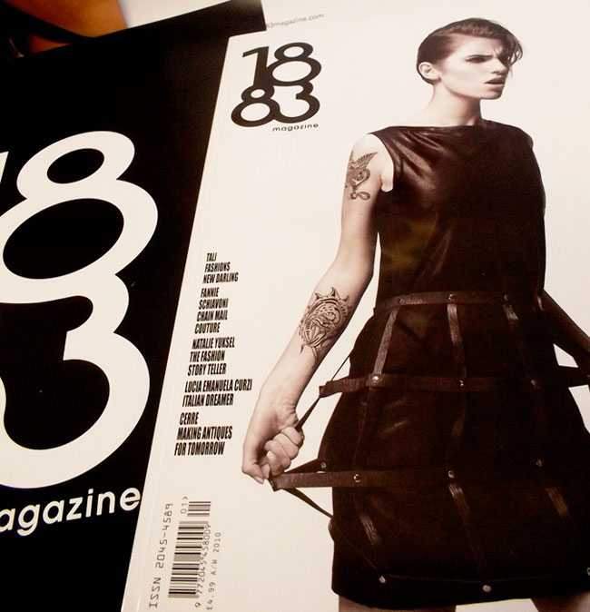
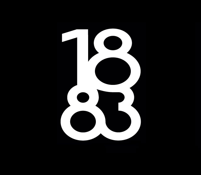
The curvy logo design for this magazine instantly captures attention and the way it has been placed on a black background in the second image portrays just how effective it is as an image alone. The content is aimed at fashion lovers and the function is to provide necessary information to sell products to the reader. It looks like a high budget magazine with a lot of potential.
plentyofcolour.com
Limited edition boxset by Fontsmith designed by Thompson Brand Partners for their 10th anniversary of their typeface library launch.
Lovely striking use of colours within this design. It is a high budget piece of graphic design with the intention to advertise their library launch. It is aimed at a wide audience, as the colours would probably be appealing to the younger generations too, however the content more specifically would be aimed at an older age range. The chosen media gives it a unique printing quality and this could possibly have an effect on how successful it is in terms of publishing.
sweetpaulmag-digital.com
The composition of the photography alongside the text works really well together. The colours are striking and visually intriguing. The content of the magazine is informative and helpful. Whilst the magazine itself is low budget as I found it online, however it may also be printed too.
editorialdesignserved.co
This is something a bit different. Showing an example of a fashion magazine available online and on the iPad. The faded image in the background with the soft white text in the foreground works really well to create an inviting homepage/front cover. The content is very professional as shown below and is very minimalistic but powerful. Some of the pages are a bit more detailed with more text, however this balances out throughout the whole edition. The format is adult and child friendly as so many people now have access to the internet. It is functional and definitely serves its purpose.
In terms of content, this magazine has been well composed with a stylish, elegant touch. Aimed at an audience who are interested in fashion and made with high quality paper.
creattica.com
This magazine is most certainly a high budget publication. I am a huge fan of the colours used and how they have been used to create such impact. The composition is perfect and the content is too as they is just enough information provided without overcrowding the page. Aimed at a sophisticated audience and created using high quality paper, this is visually stunning.
SITES/BLOGS
5 examples of websites/blogs that will help you define retail and promotion:
DEFINITION
Retail and promotion plays a key part in successfully advertising. By promoting businesses they are more likely to be more successful.
EXAMPLES
Clever posters to promote ice cream.
These posters have been located in the window of the restaurant selling ice-cream. They have been cleverly designed to recreate the shape of an ice-cream cone. Aimed at a wide audience and created with elaborate and encouraging media.
Promoting Adidas in this pop up shop style is definitely impressive. The exterior provides information about Adidas originals and the format is extremely clever and memorable.
zainteriora.net
Again, successfully promoting an ice-cream parlour by creating a wonderfully inviting interior. The colours are friendly and represent flavours of ice-cream. The exterior of the shop informs the customers of what ice-cream is on offer before entering, a clever way of advertising and encouraging people to enter.
archdaily.com
The graphics inside this store are impressive and captivating. The layout and content is appealing and would draw people into the store. Very functional and worth creating a store which is a bit out of the ordinary and outstanding.
inspiredm.com
This cleve logo design combined with the classic use of black and white is striking and professional and maintaining simplicity but at the same time is creative enough to combine the letters 'e' and 'k' to make up the logo inbetween the two words. It looks as though it is aimed at men and women due to the colour scheme but could possibly just be women as it is quite a feminine design.
This design reminds me of a leaf and I think it would be aimed at a male audience. It is a clever way of branding as it is inventive and stands out from a lot of other designs out there.
renatom.net
The layout of this shop is very unique and stands out making it very memorable, the two below it are the same, especially the pop up shop. This is a very clever way of spreading business and an important element of this is by promoting their brand. In this case, the logo and the simplicity and neatness of the interior suggests that the brand has a lot of pride and wants to be a success.
This H&M beachwear is very well promoted. The location of it provides it with a unique selling feature and it is aimed at everyone as it is placed somewhere all ages can visit. The calm atmosphere would provide a pleasant atmosphere to shop in and it would most certainly promote their brand.


.jpg)
.jpg)