Thursday 28 February 2013

OUGD406 - Communication Is A Virus: Group Work Development

Today Harrison and I took on the responsibility to clarify a few issues relating to our tea stand. We went to the people in charge of building regulations and asked them whether it would be possible for us to go ahead with the tea stand on Thursday 7th February from 11am-2pm. We had a chat with them and discussed where we should locate it.
 
We were then asked to produce a floor plan to show where the table would be as well as the kettle and all of the other necessary equipment we will need. We also had to fill out a risk assessment sheet and email it back to them.
 
We then walked round the college to see how many floor stickers we will be needing and how many pages we will need to print them on. We made a to do list for the rest of our group as well which consisted of the following:
 
  • Decide on font
  • Contents and design sheet for poster
  • Decide on logo
  • Decide belly bands and bottom of the cup
  • Crit and digitalise illustrations
 

Monday 25 February 2013

OUGD406 - Communication Is A Virus: Power Crit

Today we had a power crit with Amber. We got together as a group before the power crit to make sure we had everything necessary ready. A couple of group members had proposed our idea to college on Friday and they said that we would have to complete a risk assessment form and draw out exactly where we would be setting up our tea stand.

We went outside the studio and decided the best place to locate the tea stand in the corridor but not in the way of any fire exits or entrances to any of the studios. We will be utilising the tap in the studio to fill up our kettle to make continuous amounts of tea.

After we had done this I asked the rest of the group about the brief and whether they had a written version from the weekend, but nobody had completed one so I asked the rest of my group to read over what I had written and everyone was happy with it so I printed it off ready for the power crit at 2pm.

During the crit Amber asked us where we were up to with our idea and we spoke about several issues. One of the issues was the fact that the Whittards tea would be too expensive and we would end up having lots left over which would go to waste. We therefore decided that we would use other flavoured tea bags which are more cost effective.

I also mentioned the cost of paper cups and how the ones I had found were quite expensive. Beth then mentioned that in her work they have lots that are often going spare so we are going to experiment with them before purchasing any.

Amber was happy with the brief and she was looking forward to the end result, as a group we are working really well together and I am excited to see what we produce.

PPP1 - OUGD402: Free Ad Development

I experimented a lot with Ellen's design. It was quite challenging for me to design for her, as I know her so well and live with her. This can work to my advantage but also meant that I wanted to get the design just right, as accurate as possible. I experimented with a variety of ways to present the information before settling on the final design.


PPP1 - OUGD402: Free Ad Final Designs

As Melissa has moved from a fashion degree, I get the impression that she would love to incorporate fashion into her work as much as possible. I also see her as being very feminine and enjoys use of colour. I hope I have managed to portray her as accurately as possible here.


This is my own personal ad design. I am happy with the outcome and think I have managed to portray myself as a sophisticated, professional graphic designer.


In the end I settled on this design for Ellen. I am pleased with the outcome and feel as though it represents her closely. I decided not to include the illustration she has of herself on her blog, as I didn't want it to give the impression that she only works on certain types of graphic design. I feel it is better to allow the audience to find out for themselves.


PPP1 - OUGD402: Practice and Personality

Following on from our previous session with Fred we were asked to sit in our groups of three to continue with our work. We had taken our printed free ad designs which represented each individual ready to work with.

Firstly we were asked to write down from memory or look in our notebooks for the answers we had written down for how we would describe our own design practice and how we would describe ourselves as a person.

Design Practice
  • Clean
  • Professional
  • Simplistic
  • Minimalistic
  • Monochrome
Myself
  • Neat
  • Clean
  • Polite
  • Conscientious
  • Dedicated
We then had to write down our responses to all of our ads and say write down all of the words we felt were portrayed through the examples.

Myself
  • Clean
  • Professional
  • Sophisticated
  • Minimal
  • Legible
Melissa
  • Fashion
  • Colour
  • Texture
  • Professional
  • Illustrative
Ellen
  • Simplistic
  • Monochrome
  • Professional
  • Bold
  • Clean
We were then asked to swap groups with another group in the class and sit infront of their designs. We then had to write down the similarities and differences of the designs for each individual person. It turned out that there were a lot of varying designs which indicated that the initial interview with that person to gather information was obviously not as successful as it could have been. However there were some people who had portrayed their team members in the same way and had obviously had the same impression from the original interview.

We then went back to our original table and sat infront of our group's designs. We were asked to write down the commonalities and differences between the other groups' response of our three designs we had to represent ourselves. Mine were as follows:

Commonalities
  • Simple
  • Sophisticated
  • Minimal
  • Modern
Key differences:
  • Layout
  • Shape
  • Colour
  • Composition
We then looked at the designs themselves and wrote down the things we felt worked and didn't work to represent ourselves. I found this quite hard as I didn't want to offend anyone by writing the wrong thing but it was interesting to analyse the reponses.

Work
  • Monochrome
  • Typeface
  • Simplicity
  • Less is more
  • Neutral tones
Don't work
  • Logo (LJB) because I don't actually like my own design anymore
  • Underlining of text
  • Background (perhaps plain would have worked better to enhance the foreground)
  • Illustration
  • Deduct the amount of words
We then worked as a three in our group to answer the following question:

How important is it for our personality to reflect our practice?

Pros
  • Identity
  • Distinctive
  • Personal
  • Signature style
  • Individual
Cons
  • Personality can become too dominant
  • Practice doesn't always represent personality and vice versa
  • Design is always for a topic so can't always involve personality
  • Someone's personality may not be professional may not be professional and is a hinderence to design
  • Not good to be limited to a certain way of working
TASK

5 statements about the relationship between your personality and practice:

1. I always find that having a cup of tea helps me stay motivated and makes me feel at home as this is something I have grown up with.

2. I have strong beliefs in philosophy. I find that a lot of the time life problems can be solved by simply taking the time to reflect and find the most appropriate solution, a book which helps me to do this is called the Secret.
3. Lake Windermere is a place I always look forward to visiting once a year, I find it so peaceful and relaxing and often feel inspired when I am there as it gives me a chance to wind down and take in the surroundings.


4. Although this may sound like an obvious choice to include in this post, I couldn't not include it. I feel as though my life experience has moulded who I am today and I would most certainly not have reached where I am today if it hadn't been for all of the positive and negative events in my past.


5. I absolutely love being organised in a diary and also having new stationery. I have always loved having a variety of pens, pencils and files to organise all of my work and I will usually buy it particularly if I fall in love with the design of them.


5 statements as a practitioner/designer:

1. It is important to be able to value the effect black and white design can have and to be able to appreciate the professionalism it portrays. As a designer I absolutely love designing in this way and find it very inspiring when I come across design work which is outstanding and unique, using the same colour scheme. I feel as though it is a skill to be able to grasp and achieve as a lot of the time black and white designs can also look unprofessional and not half as successful as they could be.


Source


2. I feel as though professional, corporate editorial design would represent my designs. I would say this is the audience I design for. Someone who is interested in design which is ultimately crisp and stylish.


This website was found via the Graphic Exchange website I regularly visit. I like this designer's work as it correlates closely to the way I work too.

Source
 
3. Packaging should be innovative and creative. It should remain professional but there is always room to be playful and experiment with unique ideas and designs, this is what makes something intriguing and enticing.
 
Fisherman boots packaging
Source

4. Having had some previous experience in web design prior to university I would really love to improve upon it and possibly go down this route in the future. I feel as though there is so much scope within web design as everyone is online in this day in age and it is a successful way of advertising companies. One website I love in particular is the HIGH clothing website. I love the logo but also the way the website is composed.


5. I love monochromatic design as well as sans serif fonts. This illustrates both of these things  in one design. I find sans serif fonts are more modern and striking and they work really well in this example to frame the black and white photograph.


This was taken from the Volt Cafe website, I love all of the work on there and the photography is also very well done.


Tuesday 19 February 2013

OUGD406 - Design Is About Doing: Crit

I felt as though the crit today was very successful and I particularly liked the format of it. We were all put into groups, Harrison and I were assigned to a group and it turned out that most of our group weren't in today which meant that we were asked to join another group for today. In our group we therefore had James, Jane, Pri and Danielle.

I started by presenting my work and the concept behind each idea. I then asked the rest of the group for their responses and narrowed my designs down to three of the most successful. From this I was able to ask the group for suggestions about how I could possibly improve my work to strengthen the designs. 

Below are the two designs which were liked the most and the comments which were made about each one.
 
This design was liked by two of the group members as they liked the use of colour. They felt it created impact and they were instantly drawn to the heart. 
 
Everyone in the group liked this design and said that I could maybe try it with a red heart in the centre rather than a white heart, as it may draw in more attention. I will therefore show these changes and experiment before making a final decision on the most successful design.


I got most feedback on this design as it is quite detailed and I wanted to know what I could do to improve it. Once again I was told to try it with red in the design. It was suggested that I could change two lines vertically and two lines horizontally to just break the background lines up a bit. I was also told to maybe try erasing the lines from inside the tuxedo and placing heart inside it in the same way I had done on the first idea. 


I experimented with all of these ideas and came to the conclusion that I actually preferred the middle idea with the heart remaining white. This is because I felt as though the red in the centre was too harsh and it made the design look less professional. 


Monday 18 February 2013

PPP1 - OUGD402: What Is Design Practice?

Powerpoint presentation notes

"(Graphic Design) is an ongoing examination/conversation between the dynamics of personal exploration and professional practice" Matt Owens, Volumeone.
  • Appropriateness of response
  • Quality of resolution
  • Meeting the deadline
Appropriateness of response
  • What is the problem?
  • Who is the audience?
  • What is the context?
  • What is the method of delivery?
What is a problem?

Are you being asked to... or do you want to?

Persuade, inform, promote...

What is your rationale?
  • Preferences
  • What you plan to do
  • Thought processes
  • Reasoning behind something
What are you doing and why?
  • Concept driven
  • Idea driven
  • Research driven
We might have a reason for why we are driven in a certain way.

What are the benefits?
  • Different briefs require us to work in different ways
- Creative
- Ethical
- Commercial

Where are my preferences? Am I driven by certain things? Eg. Commercial - Concept which could bring in the most money for me.

If I was commercially driven I can't ignore the ethics and so on.

- Handmade
- Digital
- Lens based

How does my practice reflect this?
  • 2 dimensional - width, height
  • 3 dimensional - depth (for example packaging)
  • 4 dimensional - movement, time (for example sequential communication)
Quality of resolution
  • Depth of appropriate research
  • Breadth of appropriate research
  • Selection of potential solutions
  • Thorough visual development
  • Attention to detail/crafting
  • Clarity of presentation
Type and/or image?
  • Both
  • One or the other
  • Develops our 'style'
  • Signature or visual identity
Is the media the message?

Tone of voice?
  • Serious/authoritative
  • My tone of voice as a designer
  • We can set down markers to attract the type of work I want to be involved with
What is it that makes me me?
  • Need something unique to separate from the rest
  • Try it
  • Test it
  • Make it better
Never forget to play!

COLLABORATION

The space between people working together is filled with conflict, friction, strife, exhilaration, delight, and vast creative potential.

Meeting the deadline!
  • Time management
  • Key element of our practice
Message, communication, clarity and context + creativity, concept, ideas = skills, organisation, discipline, commitment = boundaries, limitations, rules, time

= An effective design practice

After the presentation we then went into the studio and we were given a list of questions to answer individually. My questions and answers are shown below:

What is your professional name and contact details?
What 5 words best describe your design practice?
  • Clean
  • Professional
  • Simplistic
  • Minimalistic
  • Monochrome
What 5 words best describe you as a person?
  • Neat
  • Clean
  • Polite
  • Conscientious
  • Dedicated
What are your 5 strongest design skills?
  • Packaging
  • Drawing simple illustrations
  • Composing publications
  • Crafts
  • Photoshop
What areas of graphic design interest you the most?
  • Packaging
  • Branding
  • Editorial
  • Web design
  • Retail
Who are your 5 favourite designers/design studios?
  • Fabien Barral
  • Graphic Exchange
  • John Warwicker
  • Vogue editorial designers
What makes these your favourite? Where can you see their work?
  • Mr Cup website
  • Unique style/signature
  • Their own blog and graphic exchange
What are your 5 favourite design blogs?
  • Designspiration
  • Graphic exchange
  • Creative review
  • Dieline
  • Lovely packaging
What 5 things do you want to be?
  • Editorial designer
  • Art director
  • Freelance designer
  • Packaging designer
  • Identity/Logos
What 5 things do you think you need to do to be this?
  • Experience in studios
  • Outgoing - ask questions
  • Extra work/studies
  • Collaborative briefs
  • Live briefs to get recognised

  • What is your professional name and contact details?
SetDesigns or ESetDesigns
  • What 5 words best describe your design practice?
  1. Simple
  2. Minimalistic
  3. Clear
  4. Black and White
  5. Easy to navigate
  • What 5 words best describe you as a person?
  1. Clean
  2. Tidy
  3. Neat
  4. Friendly
  5. Thoughtful
  • What are your strongest design skills?
  1. Generating ideas
  2. Researching subject matter
  3. Simplistic Design
  4. Functional
  5. Following the brief
  • What areas of Graphic Design interest you the most?
  1. Editorial
  2. Product and Packaging
  3. Information Graphics
  4. Web Design
  5. Retail
  • Who are your favourite 5 designers/studios?
  1. Anthony Peters (IMEUS)
  2. Analogue
  3. Boom Artwork
  • What makes these your favourite?
  1. Simplicity
  2. Creativity
  3. Unique
  4. Clear
  5. Powerful
  • What are your favourite design blogs?
  1. Dieline
  2. Illustrationweb
  3. Creative Review
  4. Lovely Packaging
  • What 5 things do you want to be?
  1. Editorial designer
  2. Successful
  3. Web Designer
  4. Well Known
  5. Highly thought of
  • What 5 things do you need to be to achieve this?
  1. Motivated
  2. Organised
  3. Aware of the design industry
  4. Up to date on software
  5. Reliable
Melissa's answers..
  • What is your professional name and contact details?
New Design
melissa@newdesign.co.uk
  • What 5 words best describe your design practice?
  1. Simple
  2. Minimalistic
  3. Innovative
  4. Relevant
  5. Effective
  • What 5 words best describe you as a person?
  1. Creative
  2. Conscienscious
  3. Precise
  4. Motivated
  5. Organised
  • What are your strongest design skills?
  1. Drawing
  2. Photography
  3. Layout
  4. Colour Awareness
  5. Photoshop
  • What areas of Graphic Design interest you the most?
  1. Editorial
  2. Print
  3. Photography
  4. Type
  • Who are your favourite 5 designers/studios?
  1. Manuelrobello
  2. Kelly Smith
  3. Sarah Hankinson
  4. Rankin
  • What makes these your favourite?
  1. Fashion Related
  2. The use of media
  3. Own Identity
  4. Clean designs
  5. Sophisticated
  • What are your favourite design blogs?
  1. Birdy and me
  2. Manuelrobello
  3. Trendland
  4. Underwerket
  • What 5 things do you want to be?
  1. Successful
  2. Unique
  3. Editorial
  4. Sophisticated work
  • What 5 things do you need to be to achieve this?
  1. Mtovated
  2. Remain interested
  3. Research
  4. Self Reliant
  5. Time Management

Tuesday 5 February 2013

PPP1 - OUGD402: Where Am I Now? Study Task 5


10 things I have learned about myself as an individual and as a learner:

1. I have most certainly learnt how to manage my money in a way that allows me to not only be able to afford the necessary equipment and supplies for university, but also allows me to enjoy myself during my spare time and socialise. I feel that this is extremely important whilst completing my degree as there is so much graphic design surrounding us, within shops and in public in general which helps to stimulate ideas. This is much healthier than being stuck inside all of the time and limiting myself to using the internet alone for inspiration.

 
2. I have improved my time management. I have always been obsessively organised and on time with work and other commitments in life but since starting this course I have developed an even tighter schedule to allow me to get my work done and take some time out to relax.


3. I have learnt that there are lots of different personalities at university, some of which can really clash. So it is important to be able to learn to get on with each other, whether it be living together or working together, and make the most out of a situation. This has allowed me to mature even more and realise that there will always be people like this throughout life which we will constantly have to deal with.
 
 
4. I have learnt to concentrate on each day as it comes rather than planning too far ahead where work is concerned. This is because things can change and ideas can change where work and learning is concerned. For example I may have an induction to a software workshop and learn something new which can be applied to my own work and can in turn alter the final product. It is therefore important to learn on the job rather than jumping too far ahead with the perhaps limited knowledge I already have.


5. Having always been interesting in graphic design and having taken a year out to work in industry and then complete an art foundation degree this reinforced just how much I want to work for a career in this sector. When I was accepted on the course I was unbelievably happy to have been chosen and I have since learnt and become more and more aware of just how content I am to be studying on this course. I am extremely excited to build my knowledge and achieve what I want in life. I have definitely learnt that this has been 100% the right decision for me.

 
6. I have learnt to adapt as I am used to having money after working for two years prior to university. Whereas now I am much more limited, but at the moment I would rather cut down on certain things and be able to fully concentrate on my degree and enjoy myself during the first year. Then next year I will look for work and work experience in the industry. My dream job has always been to work for Vogue, however since starting the course I have realised that there are many more opportunities out there which would suit me, which are also not related to editorial work, perhaps packaging or branding instead.


7. Moving to Leeds has given me so many opportunities. Even in the short space of time I have been living here I have learnt so many new things. I feel as though I have grown and matured as I have only myself to rely on for everything, meaning that I have a lot of responsibilities alongside completing my work. I feel that this has enabled me to become more self reliant and feel at an advantage to those who are still living at home, as it will be less of a shock when we graduate and move on to the next step of our lives.


8. I have learnt that it is important to take the time out to reward myself for working hard. I try and get everything done throughout the week and keep my weekends free to enjoy. Or alternatively I will work hard on a Wednesday and have the evening free to go to the cinema or for meals. This helps make the workload seem less stressful by having things to break it up.
 
 
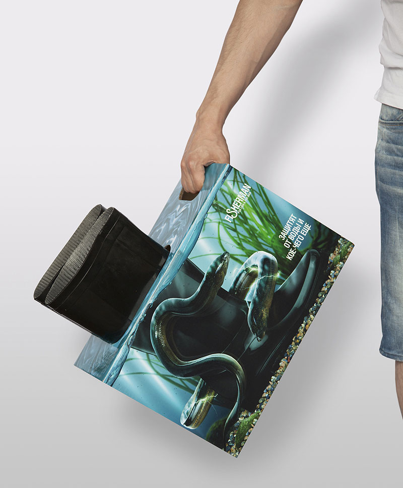
9. Everything we do and everywhere we go there is graphic design surrounding us. As an individual, I have become more and more aware of my surroundings and I am constantly looking out for anything which I find inspirational. I have recently found myself watching adverts on television and looking at how colour has been used, since studying the colour theory. It is almost as if I am gradually growing as a graphic designer and I am becoming more aware of design wherever I go.


Thomas Sabo window display

 
10. I'm not sure whether this is a positive or negative but I find that often, I work better when I am at Liberty Park, as I can concentrate more without the distractions of people around me. I also have a set up which is really convenient, as I have my printer constantly ready to use as well as an extra monitor. I do enjoy working in the studio too however, as it is important to be able to ask peers about whether or not I am going in the right direction with my work.


10 things I have learned about myself as a designer:

1. I am interested in a lot of different areas within graphic design. Branding and identity is one of them. I find it particularly interesting how a business brands themselves and how their success is largely based on their identity and the public's ability to recognise a well established design. I feel as though there is a lot of potential in this area and would love to explore it more as I find it exciting.

Union Yard brand identity design

2. I have realised I am quite passionate about packaging and construct throughout my time at university so far. I feel as though I managed to produce packaging which was quite successful and would love to pursue this as a career possibly in the future.


3. Editorial and publishing is something I tried out before starting this course and I loved it then. I hadn't used InDesign to produce the magazine I created however, whereas now I am being taught the correct programmes to use and would love to base one of my briefs on editorial and use InDesign to create it. I feel that this would give me a clearer idea about what route I would like to take and what I would like to specialise in.


4. I have learnt the importance of staying calm and not getting worried or stressed about work. It is more productive to take the time to enjoy producing a piece of work and more ideas flow with a clearer, calmer mind. As a result I have been able to appreciate the importance of developmental work and often it is the ideas behind a design which form the importance of the final product.

 
5. I have learnt just how important it is to know and understand the colour theory as thoroughly as possible. I feel as though at the moment I am starting to grasp it but most certainly need to take the time out to study further to ensure I have a strong understanding of it.


6. To be able to successfully work in a group is imperative with graphic design. We have completed a couple of briefs whereby we had to work on one week briefs and present our work on the Friday. I found that in some situations there were certain people who would sit back and not work as hard, this meant that the rest of the group were in charge of making sure everything was finished on time. For the first 'How To' brief, I felt that our group worked really well together and we managed to produce a variety of different designs to present. Overall I was very happy with the outcome and we were able to get to know people well in terms of the way they like to work.
 
 
7. I have developed an understanding for the importance of recognising interesting websites, designers and blogs which are inspirational to me. One designer in particular called Fabien Barral is someone I aspire to work like in the future when my skills have improved and I have developed a stronger understanding for the different elements within graphic design.


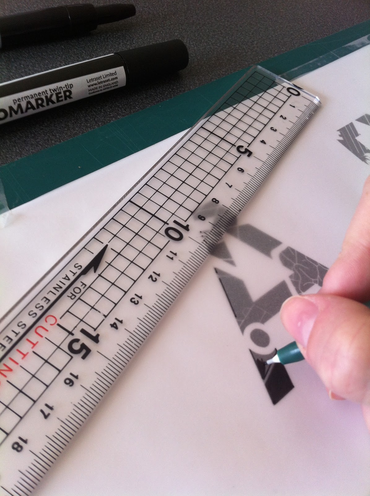
8. I have realised the importance of type. There are so many things to consider when applying type to a piece of work. The content of the design is of great importance as it can influence the typeface we choose to use. Composition of type on a page is also very important, as we have to consider the way the mind works and reads in a logical order, so by placing certain words in certain places can have an adverse effect on the message we are trying to portray. The anatomy of type is something I need to master as well, the starting point of this is learning the different parts of the letterforms and learning how to manipulate type to make our own typefaces.


9. I have really surprised myself throughout this course, as previously I was never confident in my drawing abilities, whereas now I seem to incorporate hand rendered drawings in to most of my briefs. I have recently bought an inkling and a wacom tablet too, as this is something I hope I can improve upon and feel more and more confident with. One of the things I feel most proud of is the alphabet I drew by hand with fine liners, this took 10 hours but I was so pleased with the outcome which made it truly worth it.
 
 
10. I feel as though I have been fully informed and educated about crits and how there are so many different types of crits to evaluate work. This has been an eye opener in to what the industry is like and I have witnessed honest judgements being made about my own work as well as others. This can sometimes be hard to take but I have learnt that it is important to not take things to heart but to just take everything in my stride and use compliments and criticisms as ways of improving and developing my work.