Below are some logo designs which I feel are the most successful ones I could find on each of the individual websites. I think sometimes it is obvious when someone has taken too much time on a logo and have overcomplicated it, which is why it is so challenging to create one which is successful and functional.
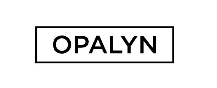
The Opalyn logo below is clean, functional and sophisticated. The font which has been used creates a bold statement whilst at the same isn't too overpowering.
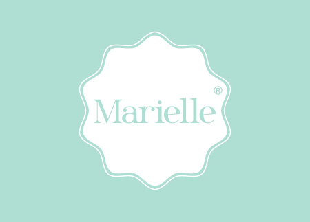
I really like this design below and feel that the colour works well against the white. Together they create a very feminine logo which is memorable and easy on the eye.
I really liked how the first part of this logo links together in a typographic sense. The way the black and white has been inverted works well to separate the two words from each other, but at the same time linking them together with the use of the same font.
I love how an image has been incorporated here, in a subtle yet successful way. I think this is very hard to achieve without it losing legibility to a certain extent, but the balance is just right here.
Although it is not my favourite, I still think this logo works well. I am not sure whether the surrounding shape is necessary but I like how each of the letterforms are rounded off, making the text inviting and professional at the same time.
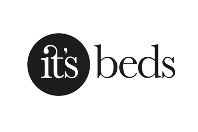
Here is another example of how an image has been subtly placed within the text to represent the word. The bold, font allows the image to fit in without it taking over, whereas if a light font had been used it wouldn't have been successful at all.
The V&A is one of my favourite museums to visit, as there is such a vast array of different things to look at. Their logo is striking and very cleverly put together, as they have managed to lose a stem completely but yet it still works just as well.
I love the symmetry in this design. The type is very representative of one I would choose to use, and the black background allows it to stand out.
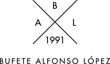
The way the initials have been separated here with the simple use of lines is very clever. It looks balanced, would be easily applied to lots of different mediums, and is functional as a logo.
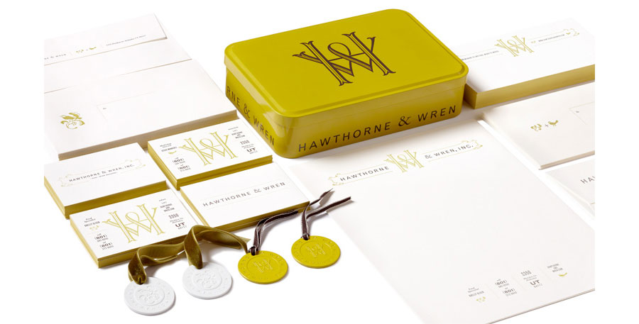
I love the logo which has been applied to different products below. I think it has a certain illustrative feel to it, and the W and the H really complement each other and merge very successfully whilst at the same time producing an ampersand in the centre.
Source
The three logos below all differ quite considerably but use the same colour palette. I love all of them and the first one reminds me of the one I created for a previous task when we had to illustrate two other people and do their branding on a poster.


Source
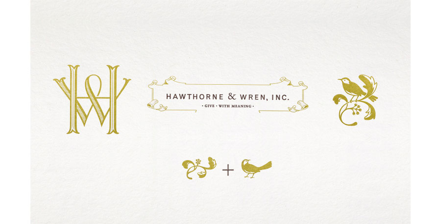
I love the illustrations, the chosen typeface and how the lines have been used to separate information here. The black border simply finishes the design and it works really well as a functional piece of design. I will most certainly be taking inspiration from this.


Source


Source


This logo design is very clever in the way that it has been produced, however I am not fond of the font which has been used to create the logo inparticular. I think I would prefer it if it was created using sans serif fonts alone. The colours however are really striking and quite feminine, and the way in which they have packaged themselves is creative and inspiring.
Source
This is quite similar to the work I found earlier, linking back to the black and white design the photographer had used to create their logo. I love the simplicity of this design and think the logo is really striking and bold.
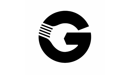
Grebban Design AB is a design and web consultancy based in Skövde, Sweden. They commissioned photographer and graphic designer Emil Karlsson, from Gothenburg, to come up with a new visual identity for their business. The brief demanded a design that was heavy yet elegant in terms of style and appearance. Emil introduced a degree of boldness to the design by emphasising and bringing to the fore the letter ‘G’.
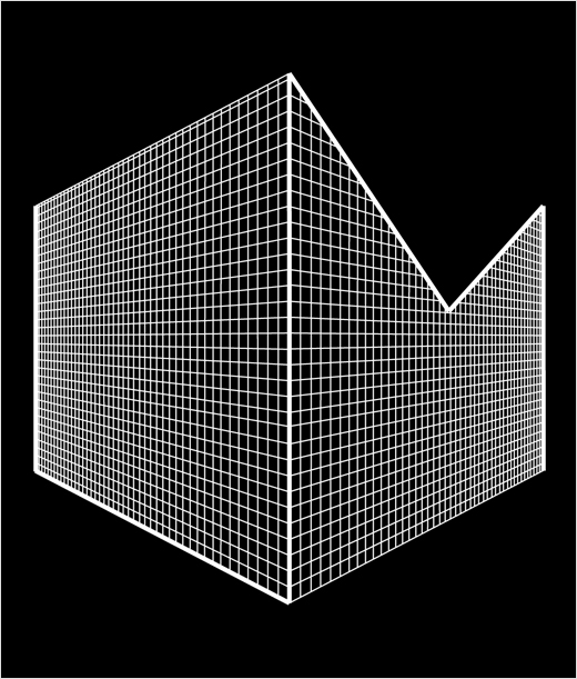
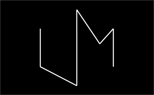
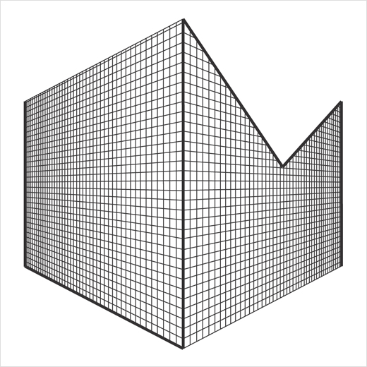
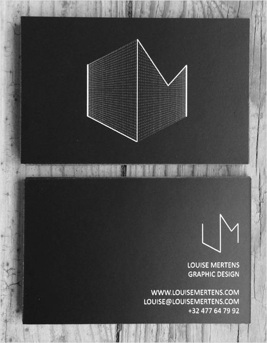
This certainly stood out to me as being one of the most striking and thought provoking logo designs. The way the initials form the shape of a cube is extremely clever in representing the individual's specialisms in a subtle way.
Belgian designer Louise Mertens is a graduate of St Lucas Antwerp University College of Art & Design (Antwerp), where she recently completed a bachelor’s degree in graphic design. For her personal identity design, Louise decided on using the initials of her name. The letters L and M are arranged, formed and interconnected around the edges and vertices of a cube. Besides doing freelance work, Louise is currently pursuing postgraduate studies at the aforementioned institute. She formerly worked as both a model and photographer, and the two strands continue to influence and inform her work.
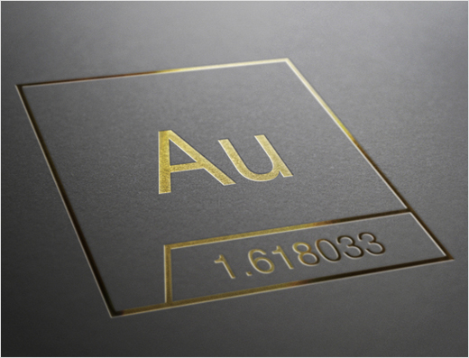
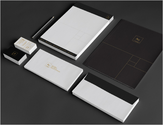
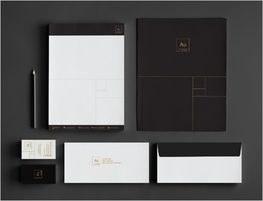
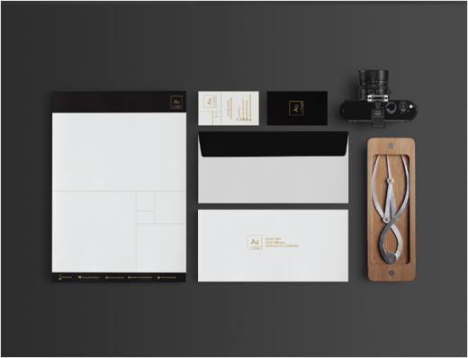
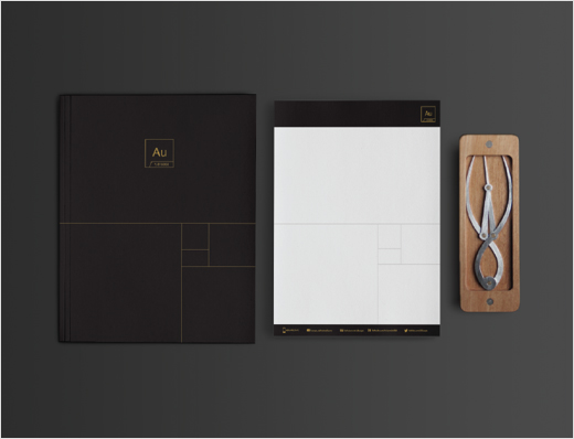
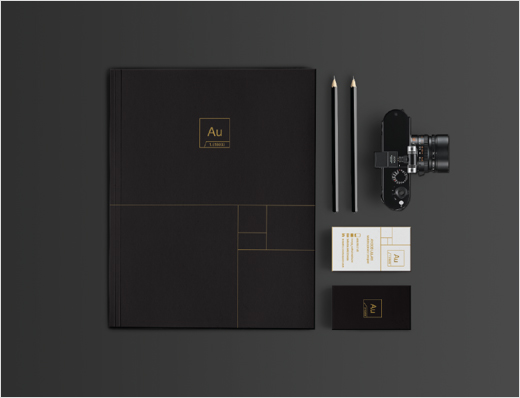
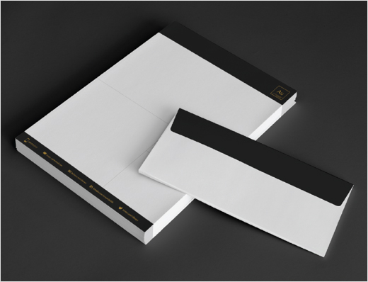
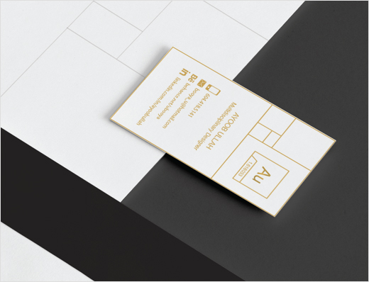
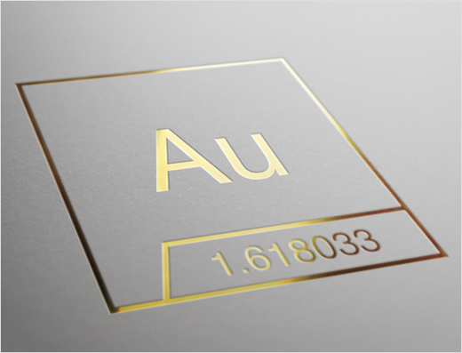
I absolutely love this. It is creative, original and very well designed. The design hasn't been over complicated and there is a lot of meaning behind how it is created.
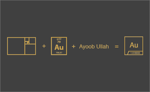
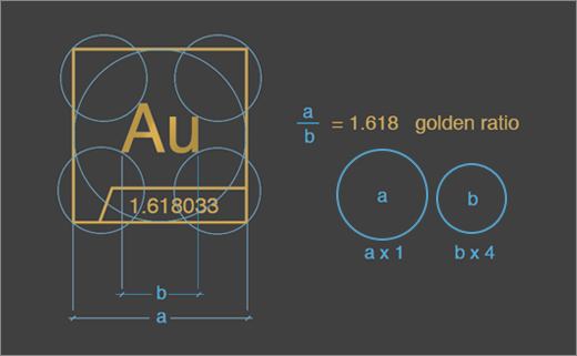
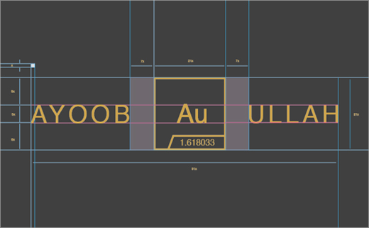
Ayoob Ullah is a freelance graphic designer from Vancouver, British Columbia in Canada. Formed from the initials of his name, the acronym Au represents his personal brand identity. The overarching theme of the logo is the famous Golden Ratio. Ayoob has constructed and devised his design using the precise mathematical proportions of the “divine section”. The choice of gold colour is further intended to correspond with and illustrate the designer’s skills and work ethics.
Reference to an inspiring website: Source
No comments:
Post a Comment