Before I start designing my website, I thought it would be a good idea to do some research into some layouts which I quite like. This way I can take inspiration from them and apply elements of the design to my own website. At the moment I am fairly certain that I want to design a website which is as clean and concise as possible.
I like the way this example is laid out. There is a clear grid system consistently running throughout and I particularly like how the headers have been designed, with certain words in bold to make them stand out from the rest. This is something I could consider applying to my website as it would work well with my branding.


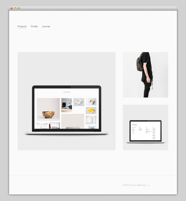
I like the simplicity of this design. The logo is simple and minimal and I quite like how there aren't too many pages, making the navigation as clear as possible to the user.
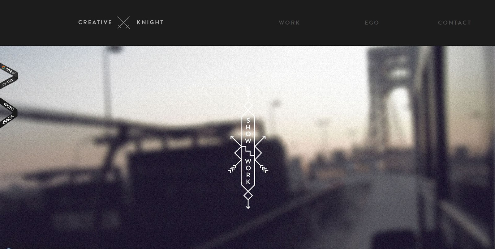


Although I am not keen on the fact that symbols have been used for the navigation bar along the top, I quite like the use of black and white. I can see my website working well in monochrome, but I will have to experiment with it first to see. I obviously want it to work consistently with the rest of my printed branding as well so I can't really incorporate a colour other than cream.


Once again here, I love how the designer has used quite neutral images. This allow the black and white content to stand out. The negative space around the text draws the eye to the text.


Once again, I like how this example only has three options in the navigation menu. This maintains simplicity and allows the navigation around the site to be as easy as possible. I also love how all of the images are quite central leaving a lot of white space around the edge. This creates impact and draws attention to the relevant information and imagery provided.

Here, a grid has been used to separate all of the information. I like the way some of the images have been cropped to show an element of the project, allowing the user to click on the image, enlarge it, and view the rest of the images provided.

I love how minimal this website is, although I don't feel as though this layout would be applicable for my own design, as I have too many projects to showcase.

I love how this website has been designed. I like how it is linear and all of the information is organised in a certain way. I would quite like to apply this idea to my website, alternating the layout slightly so that it looks a bit more balanced and interesting.

This is another simple layout. I think I have decided that I am going to use negative space to try and draw the eye to all of my different projects as this is something I have liked when I've analysed previous examples.
I like how this layout has been composed so that every other image is one full image, and then it is followed by a column separation using two images. This is something which I feel could work for my website and it would be fairly easy for me to create.

I quite like the idea of having the menu along the top of the website, however I also think that it would work quite well with the menu below my logo in the centre. I am going to have to experiment with this idea before I am sure that it will work.

I think this layout works well to demonstrate digital design. However, I am not sure whether it would look a bit too cluttered with my work, as I have a mixture of both print and web and I think it would work better with a margin in between each project.

This works really well in terms of layout. The way the full image is used followed by three columns of images works a lot better than the two columns.

This is an example of a website which has the navigation bar below the logo. This is definitely how I would like my website to look.

This is another example of how the navigation bar looks below the logo. This is another element of my website which I am sure about. I am getting excited now to start designing my own.

No comments:
Post a Comment