This post is on all of my website development. Now that I have a logo which I am happy with, I can apply it quite easily to a website. Also, because I photographed all of my work earlier on in the year this has also made it a lot easier for me as I can just simply place the images where I need them as they are already edited and ready for use.
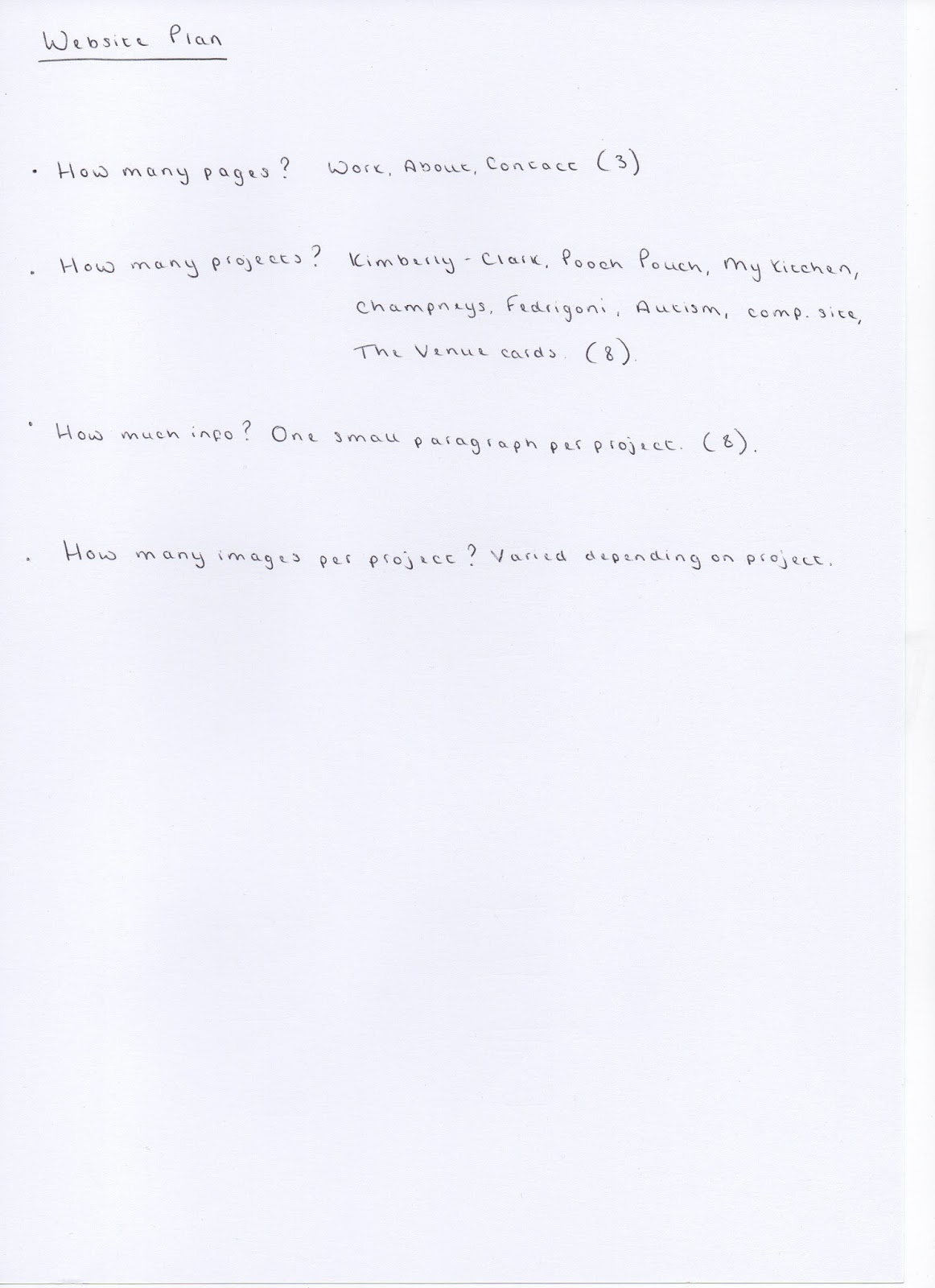
Below is my website plan. I felt as though I needed to write down how many pages in needed, how many projects I wanted to include, how much information to include and also how many images to use for each project, allowing for this to vary depending on the project.
I then wrote down how I would like to be perceived on my website. I found this helpful as I could then make further decisions concerning the aesthetic of my website and get a feel for what I would like it to look like in the end.

I then decided to print out several pages of squares to represent the screen and designed a sheet of ideas for each of my pages. I found this really beneficial as I had an idea in my head as to what I would like it to look like initially, but when it came to putting pen to paper my ideas developed so much more.
I experimented with a variety of different layout ideas for my work page. I want it to be as clear and concise as possible. I also wouldn't mind having some form of slide show included.

I would like my contact page to be very concise and straight to the point. It doesn't need to be over crowded with information which is a good thing as it will be in keeping with my branding and logo.


After I had completed these designs, I decided to draw out my final layout so that I can transfer it to screen as soon as I have it confirmed. I have decided that I would like a lot of negative space either side of the art work (inspired by research examples) and I like the idea of being able to simply scroll down through the projects. I would alternate the way in which I present the projects. The first one would be a click through slideshow, and then the next project would be set out using three columns. This would then be repeated until I have used all of my briefs. I will also have a brief description of each project underneath the images. When highlighted, the links will become underlined so that the user knows that they have hovered over it and selected it correctly.


Final Digital Layouts
Below are all of my final digital layout designs. They are all very clear and concise and I now feel as though I am confident enough to transfer these ideas to the screen.


First of all I chose a template and then I placed my logo in the centre to see whether the design I have come up with, works well when created digitally. I am really pleased with the outcome of this layout and I am feeling positive that it will work out well.

I then uploaded some images and tried experimenting with a slideshow. There is an option to have it running through automatically but I prefer the idea of the user having to click through and view each image when they have finished viewing the first one.

I also experimented with placing the next project underneath, using the same format. However, I don't think this works well, as the thumbnails look too busy and the site doesn't look structured enough.

I then had a go at placing the main image on my website enlarged and then placing three smaller images below. This works a little bit better but would be too cluttered if they were all organised in this way.

Rather than trying to improve the previous idea I had a go at adding the thumbnails back in and then placing more images below. I am still not happy with this layout though and think I will end up using the layout that I have planned out.

Rather than experimenting further with different possibilities I tried working with my initial idea. I am really pleased with the layout and feel as though it works really well. I decided to remove all of the thumbnails as I felt as though it was a little bit too busy. Once I had incorporated the headings as well as the text below each project I felt as though it worked really well.


No comments:
Post a Comment